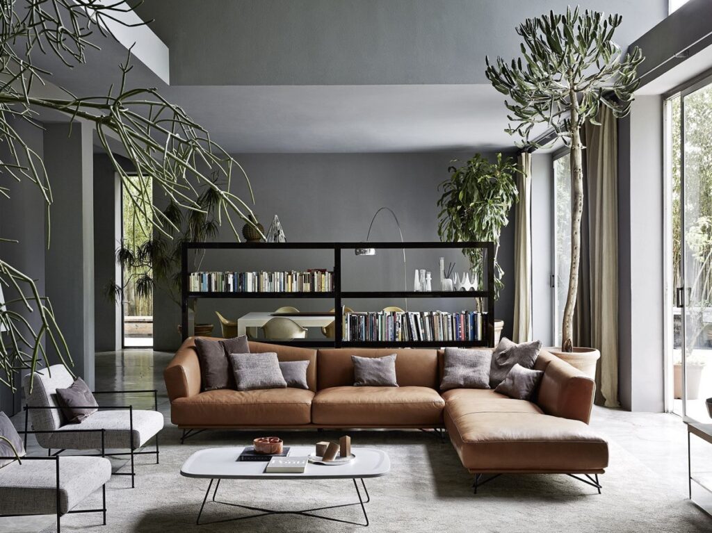
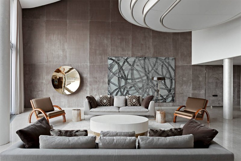
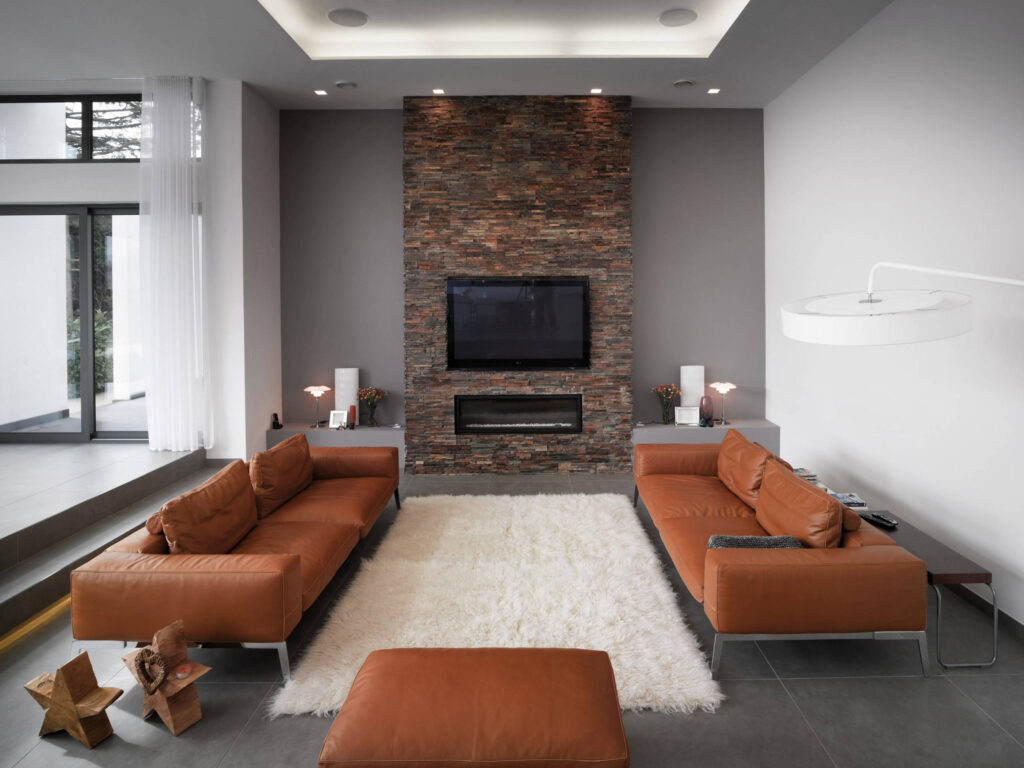
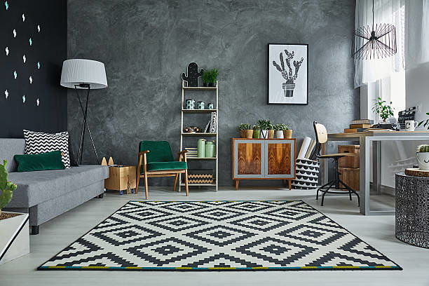
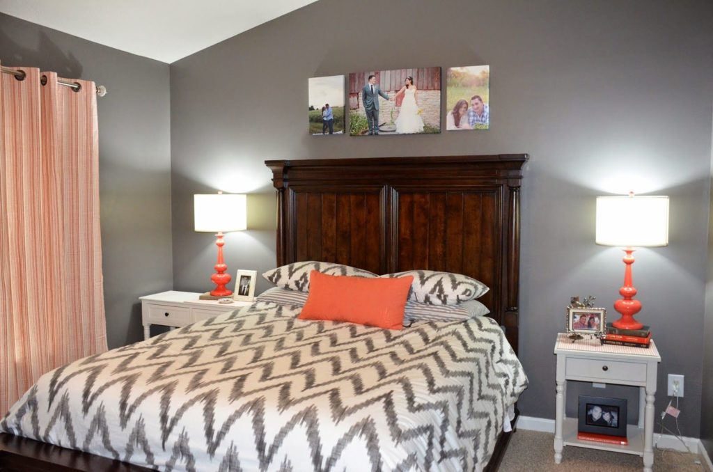
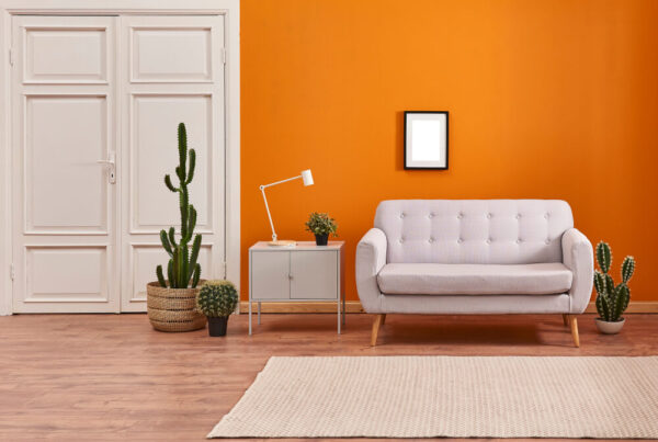
Modern Home Plans And Design Tips

MODERN HOME PLANS AND DESIGN TIPS

Whether you’re constructing, renovating, or just wanting an interior refresh, it can be challenging to find inspiration for your modern home design. It can be easy to feel frustrated with many available options — from room dimension and functionality to wall colour, furniture range, and decorative embellishments – and challenging to know where to start.

To narrow down your choices, we have shared few tips to start to figure out what’s relevant to you and what ambience you want to create in your home. Allocating a design brief can help you prioritize what you want and how to express it.

Implement earthy and neutral tones to your colour palette to produce a peaceful home atmosphere

From a design viewpoint, people are looking for their homes to feel honest and authentic. Hence, they surround themselves with textural surfaces and earthy tones. Signified by a complex and refined palette of concrete and natural materials such as timber, earthy and neutral tones help create a balanced, simple, and homely look.

The appeal of neutral tones is recommended because it makes the interior of the home appear more conspicuous. Instead of intricately carved antique-style cornices or pillars, these days modern homes are also using cleaner lines that make the house look more elegant and composed.

Some cool tones that you can use: Crisp whites, greys, black, white, browns, tan, umber, ochre, and sienna and darker colours.

Study past architectural styles for design inspiration.

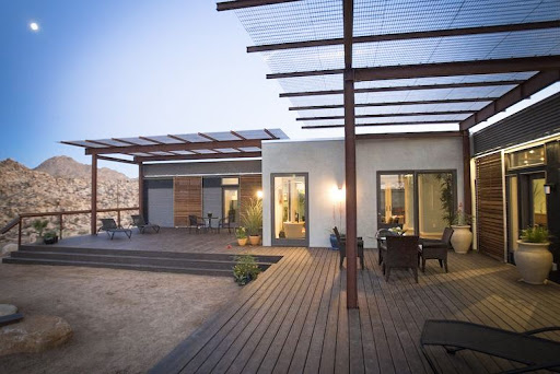
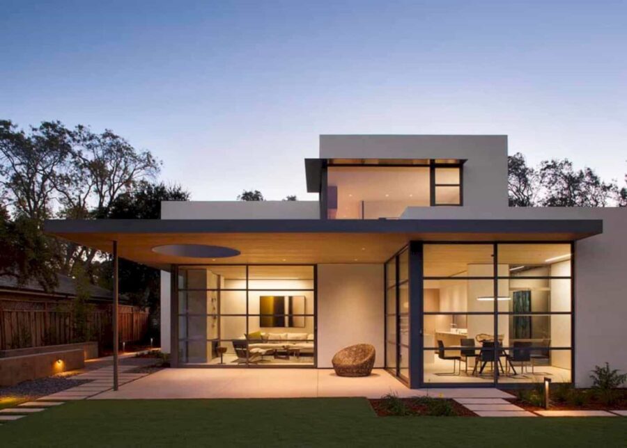
Best described as minimalist, these homes are marked by clean lines, flat or gables roofs, and dramatic edges with huge eaves and large picture windows.

Modern Home Plans And Design Tips - minimalistic modern home

When it comes to space, large floor to ceiling windows or curtains can be enough to make a room look more spacious. High ceilings also make it seem roomier – it’s crazy how a couple of hundred millimetres above your head can make such a contrast to space’s atmosphere.

Look past the labels

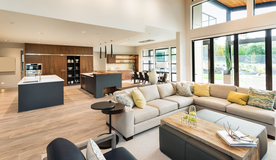
The rooms in your house don’t have to be too specific and definite. Your kitchen can include a dining area, and your study can have an entertainment area or be tucked into the living room. Most of the rooms in your house can be fused, saving space and creating convenience.
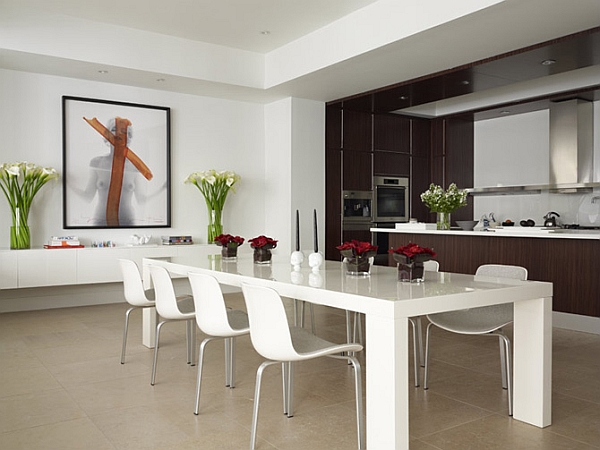
Modern Home Plans And Design Tips - kitchen and dining room minimalistic
West Chin, Rubenstein 32 W 18 NYC

Many modern contemporary homes have their kitchen as a social hub of the house. This allows owners to entertain their guests or to gather around. Beyond providing extra cook space and storage, kitchen islands can serve as an essential design feature of your modern home design while adding a pleasant aspect. Most islands reserve one side for cooking and the other for dining, but you can elect to include seating on several sides of your island to build a more friendly and flexible setting.

Bedroom Storage Hacks and Solutions

Combine convenient elements

There are several innovative tools available that make every movement and activity in your modern home more convenient. People nowadays have fancy built-in gadgets like wireless chargers on tables or retractable chopping boards built into the counter.

Shelves, closets and appliances built into the walls are also becoming more common in contemporary homes as they provide more space to move around freely. Clutter chaos causes frustration; an organized area keeps you feeling calm. Keep the aesthetic of the room clean and prominent appliances camouflaged as (much as possible), help to create a refined, polished look.

Bold and experimental pieces

Even though the current trend is to use a neutral palette with finite designs in your modern home, certain areas can get away with a tasteful pop of colour or a statement piece. For instance, you can go wild with an intricate yet modern decoration in the dining room or a strikingly patterned tile in the bathroom. These little characteristics keep your contemporary house design from seeming like a basic model home to an ultra-modern house with some of your personality infused into the system.
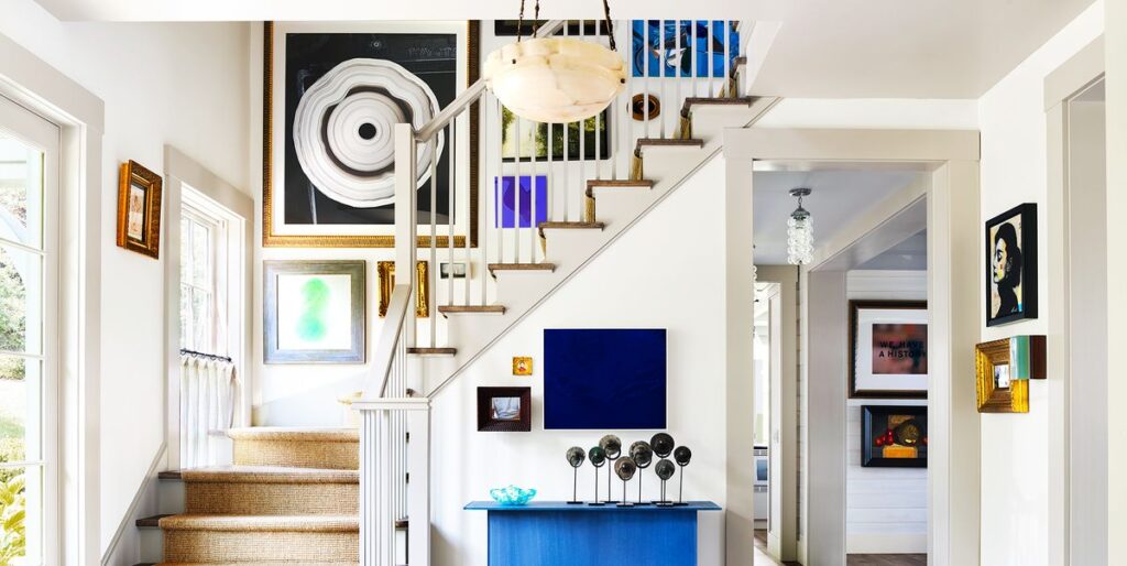
Modern Home Plans And Design Tips - Bold and experimental pieces

Source:Housebeautiful

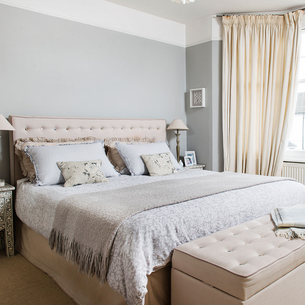
Minimalist Bedroom Tips That Will Inspire You to Declutter

Think about longevity

Pieces that have sturdiness, sustainability and low maintenance continue to be a significant factor and aim in material selection for modern homes.

If you’ve ever had mould and hard to reach places that gather dust or moisture, you will appreciate how good design and planning can save you endless hours of scrubbing and cleaning, not to mention long-term good health. And if you’ve ever had to frequently sand//paint?stain/replace components in your home, you’ll consider low maintenance, durable materials and fixtures.

Include Eco-Friendly features

Introducing more and more environmentally friendly options like recycled materials and solar energy are a big hit these days. An eco-friendly household that functions (or at least often runs) on clean energy is a welcome addition to the battle against climate change, and it’s a choice. It may seem a little pricey to begin with, but it’ll save you money in the long run.
Modern Home Plans And Design Tips - Include Eco-Friendly features

Elements such as bamboo, rattan and wood charm because they have a simple tactility to them – you can’t help but run your hands over their surface. They convey a sense of warmth and have contrast and nuance in their texture (the grains, knots and organic lines are all part of their charm).

You can also use soft accessories in linen, organic cotton and wool to bring a sense of cosiness to your new contemporary house. You can also explore along with options like low-flow toilets, LED lighting, energy-efficient appliances and tankless water heaters.

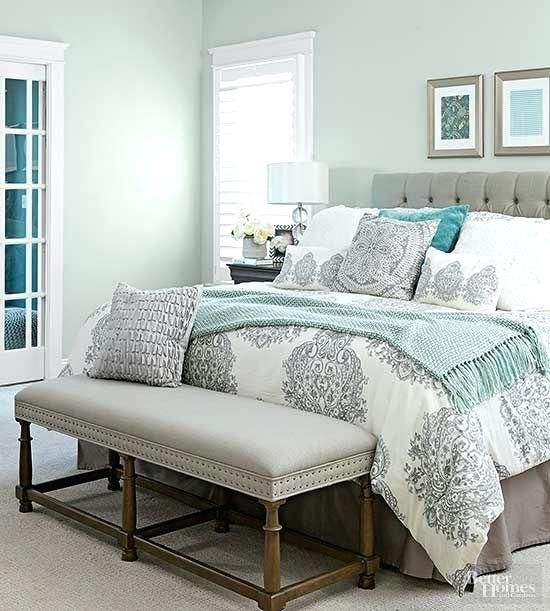
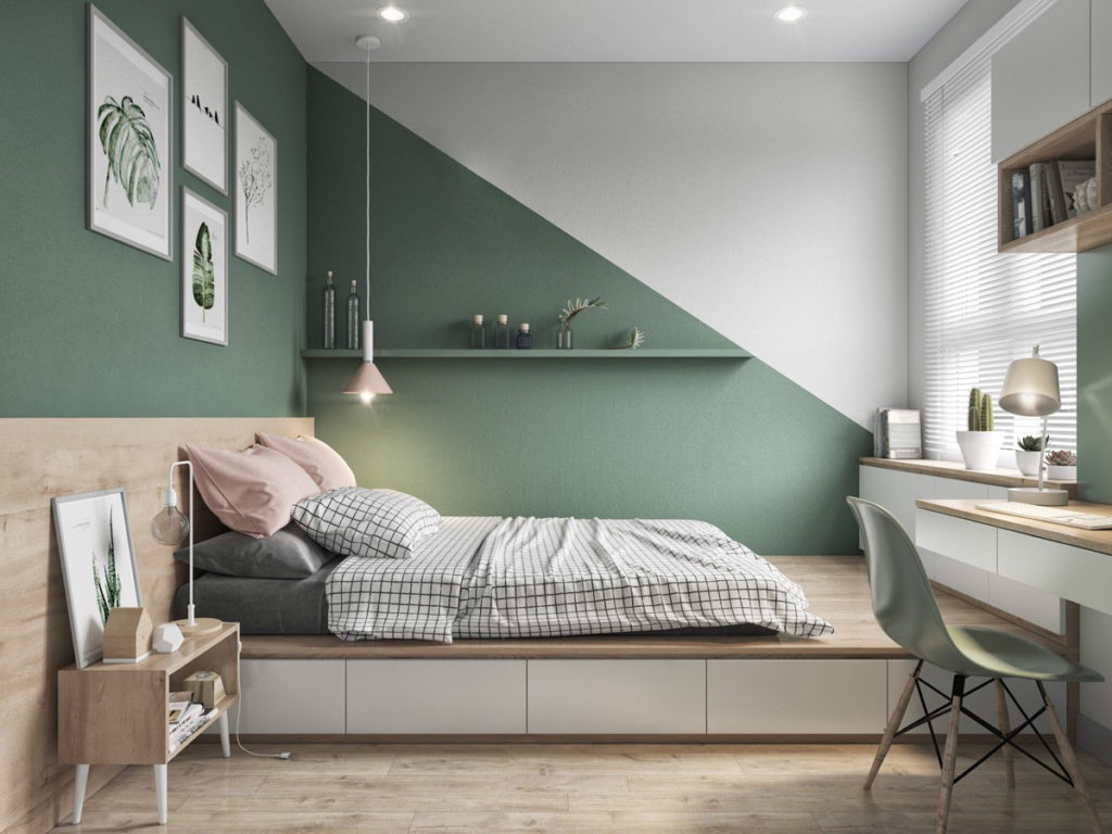
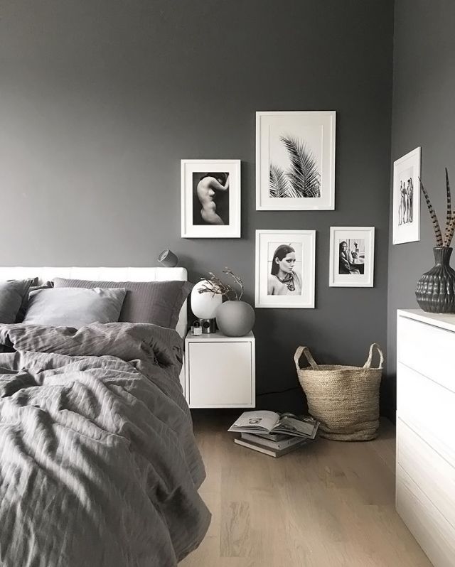
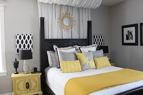
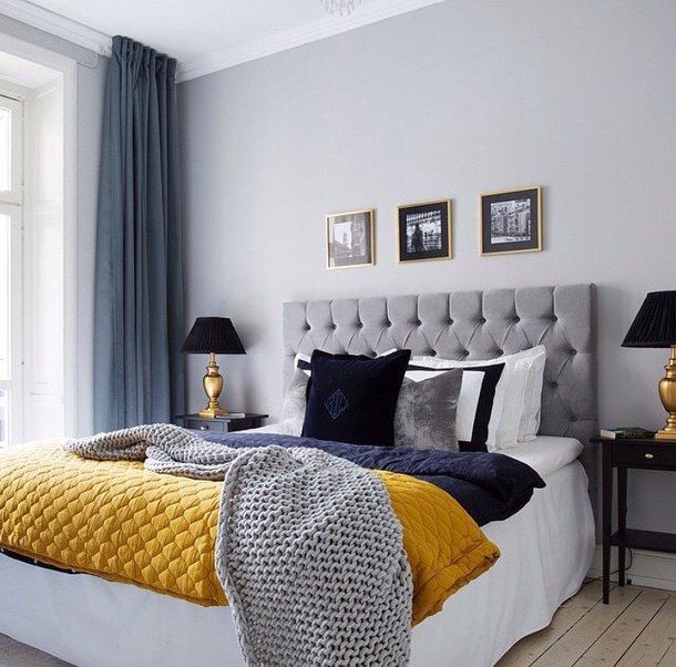
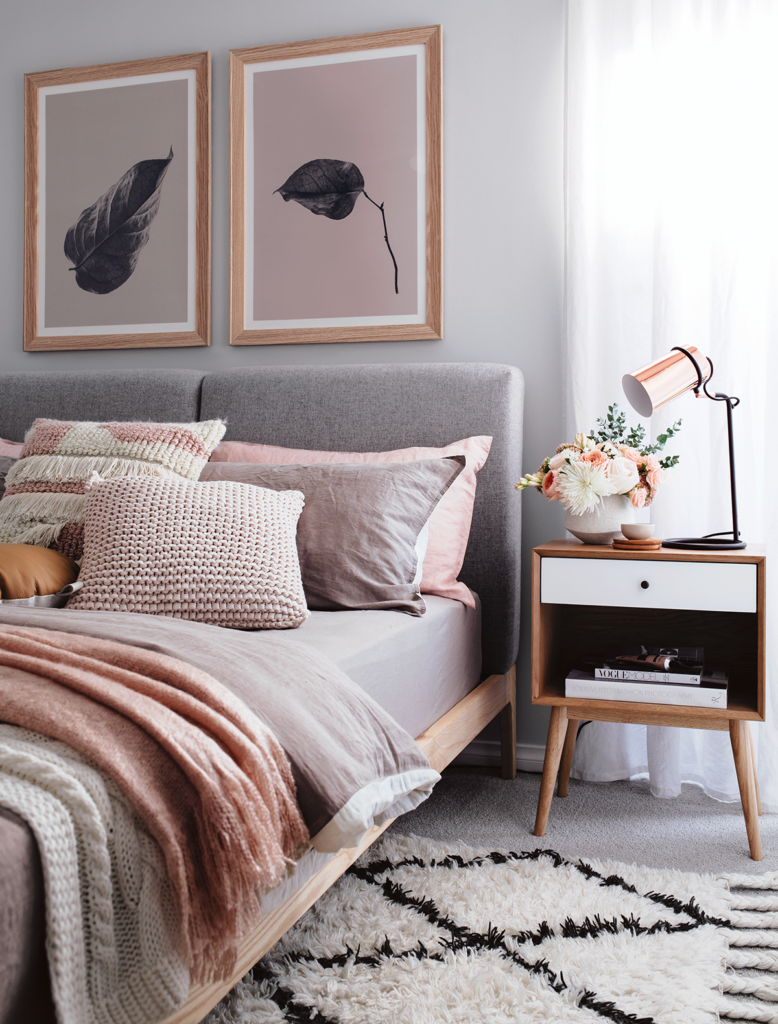
Fantastic Bedroom Color Schemes

Find more ways to bring in the natural light. 

Never undervalue the influence of natural light. Bright, airy spaces flooded with natural light can bring in happy notes and lift our mood. The overall layout and orientation of your home is the first thing you should contemplate when it comes to energy efficiency and all-round comfort. 

Orientating your house to take the best advantage of your climate zone, mapping the course of the sun and wind to plan the position and size of windows, proper shading and thermal capture, all contribute to how satisfied you will feel and how much money you could save in heating and cooling bills. 

Also, here’s another tip: consider carefully regarding window treatments, so they don’t hinder out too much light.
Modern Home Plans And Design Tips

Consider every nook 

Examine every nook, alcove, cranny, high shelf and mindfully design these areas (rather than regretting it later), so each inch of space is used and counted. Be it under-the-stairs or underneath windows, functional joinery built into narrow spaces mould these neglected spaces into functional storage solutions.
Brown and Grey Living Room Designs

do brown and grey go together

What color goes with Brown? This color often gets labeled as dull and lackluster in various fields, from interior design to fashion. However, when combined correctly with the right shades, the color brown can be incredibly inspiring, cozy, and super sleek. Brown possesses rich earthly qualities that are warm, dramatic, and enveloping. Stay Tunes, We have some tips to pair up a Brown and Grey Living room.


Brown is a neutral shade that is also very warm and versatile, opens up a whole world of opportunities once you decide to combine it with the right colors. So to assist you in making up your mind on what colors to accentuate your chocolate living room or your sandy bedroom with, we have prepared this list of the ten best colors that do wonderfully when combined with Brown.

Bedroom Paint Ideas For Teenage Girls

Wondering What Colors Go With Brown? Here is a list

  • Gold
  • White
  • Blue
  • Turquoise
  • Orange
  • Fuchsia
  • Yellow
  • Mint
  • Rose
  • Copper

There are so many colors you can experiment with, keeping brown as a background that it is nearly impossible to mention them all. However, we can certainly assure you that they’re bound to look splendid no matter which mix you choose.

Do Brown and Grey Living room work?

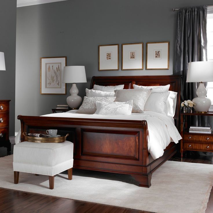
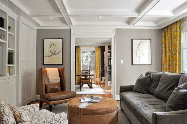
Grey and brown are some of the best color combinations you can choose for your living room. On its own, grey is trendy right now – relaxed, subtle, and versatile. On the other hand, Brown brings more warmth, and with both colors belonging to a neutral category, they are easy to pair together.


Who would think that the combination of Brown and Grey Living room will turn out nice? As you can see, there are so many ways to do it, and they all look lovely in whatever manner you do it. Of course, it is okay to add other colors in it too. It will still look stunning in the end as long as you have the right layout, and you have arranged everything well in the living room. Also, see to it that your decors and accessories match well together. Can you tell me which of the below

Brown and Grey Living room do you like the most? Would you consider using this color combination for your home?

brown and grey living room
Source: www.home-designing


You may have noticed that grey has become one of the top neutral colors in decorating. Beige and tan will probably always be the top neutrals, but decorating with grey gives you options you will not get with other neutrals. Whether your palette includes a cool grey or a warm greige (grey and beige hybrid), you will want to learn the secrets to making the most out of the grey.

Best Colors to Pair with Gray

The Right Way to Use Grey

These dos are some of the secrets of room decorating that professionals use for designing color schemes.

Familiarize yourself with the wide range of grey: If the first image of grey that comes to mind is cold and industrial, then you will want to acquaint yourself with the new greys in decorating.

Check out greige: This is an easy-to-use grey that has a hint of beige or brown. If you’re concerned that grey would be too cold for your space, testing it out could be the answer to finding the right grey.

Learn the basics of cool versus warm colors: If you can recognize the color temperature of the grey you are considering, it will make choosing a palette much simpler. Color temperature or undertone incompatibility is almost always the culprit when colors don’t look “quite right” together.

Consider charcoal grey as an alternative to black or dark blue: Charcoal grey can be the perfect dark accent without being too dark or too drab. Charcoal grey is stunning as upholstered furniture or rugs.

Do watch your undertones: Some greys can be perfectly color-neutral with no obvious undertones. Most greys have an undertone that will either help or hinder your color palette. Knowing the difference between a grey with a blue or brown undertone, or even a green undertone can help you match colors like a pro.


Have fun with grey: It’s been years since grey was considered stodgy and conservative. With the growing popularity of grey, paint, and home decor companies are offering expansive color options. If you have a color combination in mind, there will be a grey that is a perfect complement.

Boys Bedroom Ideas For Toddlers

The Don’ts of Decorating With Grey

brown and grey living room
Source: homedesignlover

Most of these don’ts are fair, positive, helpful things for decorating with grey. For example, don’t forget the versatility of grey.


Don’t forget that grey is neutral: Some color schemes contain grey and beige together, but it is probably a good idea to base your palette on one or the other.

Do not be afraid to explore with grey and beige: If you are inspired by a complex, yet subdued, look, go with it. A warm grey or greige might be the perfect complement to the right beige.

Don’t hesitate to use grey in a natural color scheme: Grey is a beautiful addition to beach-style, zen, or southwestern motifs. Warm greys are most compatible with other natural colors, evoking images of stones, and weathered wood.

Interior Design : What Color Goes With Orange

Do not overlook grey that is already in a room: Grey can be seen as a fireplace, carpeting, and countertops. If you live in an area with perpetually grey skies, a white wall can often appear grey and considered. When you add grey to any room, be sure to consider any other grey that might already be in there.

Don’t overlook creative color combinations using grey: The right grey can be gorgeous with the newest muted candy colors, such as grey and pink, yellow, or blue. Grey can also be paired with black and white to soften the palette.
Suddenly though, Brown feels right again. An excellent base for other colors weaving their way back to prominence – pale pink, yellow, orange – rooms in it look warm and sophisticated. Here’s how to use it.

How to Find the Right Shade of Grey

brown and grey living room
Source: jimenezphoto


Grey is the go-to shade for stylish spaces because it works with everything, and so we can use it with confidence in any room no matter what our style is. Greys live in color families that help you choose which one will be perfect for space and the mood you want to create. Choose by tone: light greys or dark greys and visual temperature: warm greys, cool greys, and true greys.

Cool Greys
Cool greys are perfect for south-facing rooms and rooms with lots of natural light. They create a crisp, sophisticated modern look and help to make small spaces appear brighter. The four most popular cool greys are Warm Pewter, Goose Down, Coastal Grey, and Rock Salt. Team cool grey with Pure Brilliant White or Rock Salt on the skirting boards and doors or paint the walls and woodwork in the same grey for a seamless modern look.

Warm Greys

Warm greys work best in north-facing rooms, big open plan spaces, and rooms you will use more at night. They create a relaxed, cozy atmosphere and work well with wood and natural leather. Our four most popular warm greys are Pebble Shore, Perfectly Taupe, Misty Mountain, and Thimble Case.
Team warm greys with White Cotton on the skirting boards, doors, and window frames or paint the walls and woodwork in the same grey for a seamless modern look.

True Grey
Some people argue that all greys are the same, but we know they are not. Most greys have a hint of color in them, giving them distinct personalities and choosing the best grey for our decorating rooms. True grey is a simple mix of black and white, and no other color is added. The four most popular true greys are Chic Shadow, Polished Pebble, Urban Obsession, and Night Jewels 3.

Minimalist Bedroom Tips That Will Inspire You to Declutter

Greys are the best team players.


Grey is a beautiful color on its own, but it also works so well with every other color because it’s the ultimate neutral, brilliant if you like grey – but don’t want to have it on every wall. Explore colors that work with greys like Concrete Grey, Spiced Honey, and Vintage Smoke.


Best Colors to Pair with the Color Gray – 2023

Best Colors to Pair with Gray

Are you the sort of individual who consistently sticks to neutrals while decorating a space? Well, who can’t get away from the best white paint color, best earthy colored paint shades, and best beige paint colors with regards to enriching your home? We don’t accuse you! These shades are works of art, and they go with pretty much every tone. Gray is flexible enough to remain all alone, and it comes in such a large number of various hues that you can add it profundity to a space by basically layering different shades of this particular color running from charcoal to silver. 

Here is a list of some shades that go perfectly well with the color Grey. 


Color Gray & Seafoam. 

Seafoam is such a delicate and fascinating shade as it has both green and blue components covered up together. Matched with dark shades, you’ll have an astounding, contemporary and extremely inviting space. 

Read: Fantastic Bedroom Color Schemes


Color Gray & Marshmallow. 

Feathery whites and delicate grays make such a comfortable and sentimental area, you’ll never want to leave it. It’s particularly decent for a room or living zone where you simply want some rest and do some unwinding. 


Color Gray & Green 

Once a while it’s ideal to think outside-the-box and make a customized space without “duplicating” what you’ve seen somewhere else. What’s more, with a decision like lively grass green to praise a progressively tangible gray, you’ll have an incredible astounding combination on your hands.


Color Gray & Midnight Black. 

For a work of art and neutral style with a great deal of modern mixture, blend your grays in with your blacks. It’s a timeless look without a ton of fuss and you’ll get an exceptionally edgy and manly vibe easily. 

Read: Interior Design : What Color Goes With Orange


Color Gray & Sunny Yellow. 

Gray and bright yellows are one of the most popular in vogue of shading combinations. It’s a funky and out of control, and inconceivably flexible as it can be utilized truly in any alcove or corner of the house. 


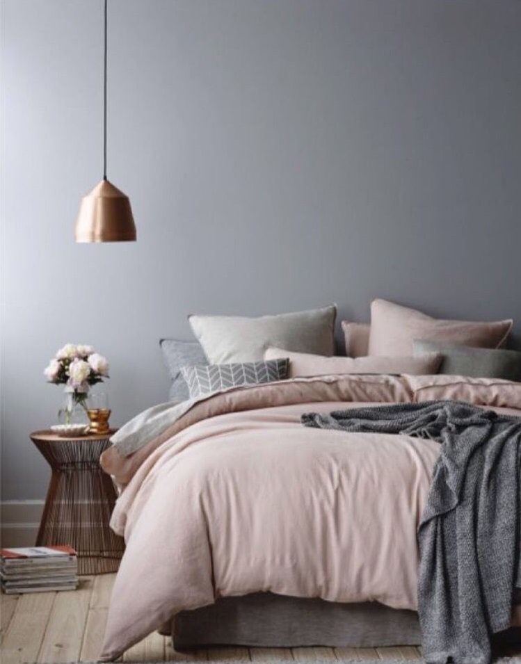
Color Gray & Rose. 

In case you’re searching for a progressively female and advanced style without the brutality of the typical tones, evaluate a rosey pink combined with your dim determination. It’s very beautiful and enjoyable to play with. 


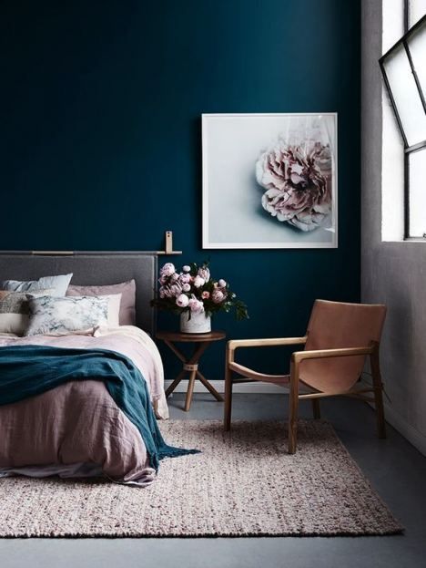
Color Gray & Blue

Water blues and grays can make an extremely unwinding and invigorating space. From your home office to your washroom, in case you’re on the quest for a shading blend that talks about clean lines and hot style – this is it! 


Color Gray & Cherry. 

Splendid and striking, cherry reds will make anything or any space pop, particularly when combined with gentler shades. We love the differentiation of the two tones and believe it’s an extremely extraordinary and fun decision. 


Color Gray & Violet

For a hotter and more design forward vibe, incorporate violet when choosing a matching for your dark gray space. This is a more profound shade of purple which can add an extra zing to turn your home. 


Color Gray & Coral

This is one of the most well known combinations. Coral is an exceptionally ladylike however liberating and enthusiastic color decision. It’d be impeccable for the lounge area, kitchen or living area!

Read: Minimalist Bedroom Tips That Will Inspire You to Declutter


The paper-writing.net company’s services are targeted at high school and college students.

Interior Design : What Color Goes With Orange

Orange Color Room

We often overlook using the color orange in our homes as we find it bright and bold and too brilliant to use in our homes.

Probably one of the first things to mention is that Orange isn’t for everyone. It is, therefore, essential to find a tone that resonates with your personality. 

The broad scope of shades and tones in the orange shading family has loaned itself well known in numerous a la mode homes. You can frequently find splendid shades of bright tangerines, warm tones of consumed orange to the cool tones of Persian Orange, as interior inspirations. 

Breathtaking Walk-In Shower Designs

Orange Color Meanings and Associations

Orange, being the happy, cheerful color, usually stands for being – 

Warm, Anti Depressant, Happy, Joyfulness, Assertive, Dynamic, Spontaneous, Liveliness, Welcoming, Cheerful, Social, Pleasure Seeking, Extroverted, Decreases Irritability And Hostility, Emotional, Exuberance, Active, Boldness, Improves Social Behavior. 

Pure orange color is all about fun, bliss, and liveliness. It supports social communication in a fun, conversational way. Orange additionally speaks to physical solace and communicates the sentiments of wealth.

Given the extraordinary dynamic quality and immersion of the color orange, it helps to get individuals motivated, revitalize their vitality, endurance, and give them a genuinely necessary lift, which is reflected in the measure of red accents noticeable in color. Being Orange, there is an additional yellow present, which is tied in with making fun, bliss, and positive thinking. 

Orange Color in Interior Design

It is worth observing that Orange can be energetic, fortifying, fun, and refreshing. Simultaneously, Orange can be dynamic, energetic, and scary. It’s essential to check out the assortments so you can locate the ideal shade that reverberates with your character. 

Knowing how a specific shade of Orange can affect a room is the way to utilizing this color. At the point when done right, Orange can give you an essential portion of energy and inspiration. Also, when used inadequately, it can very well be excessively, extravagantly silly, and overstimulating. 

Minimalist Bedroom Tips That Will Inspire You to Declutter

1. Orange kitchen 

Orange gives this sleek kitchen a cutting edge vibe. The energetic and polished shade likewise lights up this smaller life with no regular lighting. 

2. Orange lounge room 

Warm Orange joined forces with earthy colors makes this lounge room look comfortable and welcoming. The upholstery and floor covering are impartial hues likewise fill in as a foundation to make the Orange emphasize pieces pop. Out and out, the outcome is a tasteful search for a loosening up lounge. 

3. A two-conditioned orange lounge area 

This rich lounge area is an excellent showcase of how Orange cooperates with the hues yellow and red. With yellow, it paints a fun, perky, and hopeful environment. With red, it very well may be severe and sensational, just as emitting a feeling of success. 

4. Orange room 

The correct shade of Orange is critical to make a loosening up mind-set to the room. A warm orange mixing with neutrals can be quieting while flies of Orange in the tosses, draperies, and presentations can flavor up the general look and even make a cheerful vibe. 

5. Orange home office 

This home office has no limits when it came to picking its prevailing shading. Which is all well and good; the vibrant Orange all through the room is thoughtful that energizes, animates, and supports vitality. Exactly what you need when you have to center and squeeze up your inventiveness. 

6. Orange Foyer

This foyer demonstrates that an explosion of Orange is all you have to make a room look fascinating. While it makes the room look current, out of control, and fun, this shade of shading likewise makes a warm and welcoming intrigue, which is simply ideal both for inviting and wowing visitors. 

7. Orange restroom 

This restroom gets elevated with the orange divider tiles. The beautiful and reflexive orange tiles light up the little space while the yellow tones make the bathroom look cheerful and fun-loving. Basic yet splendid. 

8. Blazing orange kitchen 

Orange invigorates the hunger, so this should function admirably for this eat-in kitchen. It additionally helps that this shading energizes social communication and the capacity to bear others. It goes connected at the hip with this contemporary kitchen, as made evident by its design, particularly of the promontory breakfast bar. 

9. Lounge room with orange accents 

Tangerine toss cushions give a genuinely necessary increase in vitality to this family room. Without the brilliant emphasized pieces, this room would look dull and exhausting, given its abundance of a neutral palette. 

10. An orange and white lounge area 

Orange dividers make the lounge area hang out in this prevalently white clear idea inside. It likewise makes a warm and comfortable space in an ocean of crisp whites. The orange room sets a positive state of mind, causes one convenient to up, and empowers holding over suppers. 

Bedroom Storage Hacks and Solutions

11. Room with hints of Orange 

The correct shade of Orange can be too dynamic or animating, particularly for a room. An explosion of Orange on the bed includes visual enthusiasm without its danger being diverted when you’re set down. 

12. Orange and blue lobby 

The blend of Orange and blue makes this hall look fun, exuberant, and brilliant. The hues supplement one another with the goal that blue makes the Orange progressively orange and the other way around. The interaction of light cool blue with fresh white additionally makes a waterfront vibe while the orange complement divider radiates a warm and bright demeanor. 

13. Orange and white kitchen 

The orange cabinetry heats the room and gets everyone’s attention as it fills in as the kitchen’s central focus. The wealth of white, like this, balances the warm tones of the cabinet and includes a light and breezy impact. 

14. Lounge area with orange complement divider 

The splendid orange dividers make this lounge area wake up. Contingent upon the shade, Orange can make a room look little or huge than it is. For this situation, the brilliant bright shade joined forces with cool fresh white including visual space, just as cause the area to feel sprightly. Flies of Orange on the table and the consumed orange seat likewise hold the whole look together. 

15. Little orange home office 

Here’s a smart method to utilize Orange for a little home office. To expand the extra room, boxes of complementary hues make a look of composed mess in the vertical space. The divider additionally gives an increase in inspiration and invigorates the psyche. One should simply gaze directly ahead and face the divider. 

16. Little orange passage 

The orange highlight divider makes this little space for a section look shocking and chipper. The disheveled layers of the snares and open stockpiling workspaces make a fun and lively impact. Flies of earthy colored on the orange space likewise result in a luxurious look. 

17. Room with orange complement divider 

This straightforward room gets revived with accents of Orange. The blazing orange divider makes a dramatic impact just as an enthusiastic vibe. Set behind the bed, the emphasize divider doesn’t occupy when one needs to rest off; however is intended to invigorate when one’s physically functional. 

18. Orange and turquoise kitchen 

The mix of Orange and turquoise causes this to eat-in-kitchen look chic and crazy. The realistic example and mustard-hued drapery against the divider additionally include for a general retro intrigue. 

VSCO Bedroom Ideas – Tips and Tricks

19. Orange contemporary washroom 

All alone, Orange can be excessively dynamic and extraordinary. For this situation, the apricot conceal is all that is expected to top off the contemporary look of the powder room. A few people concoct their million-dollar thoughts from their stay in the restroom. 

20. Orange earth-themed foyer

Various shades of Orange communicate with earthy colored and green highlight pieces for a rich natural topic. Shades of Orange can likewise be utilized for a Southwestern toll or whatever subject your inventive brain can think of.

Reasons to Include ORANGE into your Interior

Once in a while, when you need a change, your bedroom is the least demanding spot to begin. 

A lively fly of color can make a happy home and a blissful state of mind. To add a turn to your home layout, search for pieces with a sprinkle of Orange. This intense color is the ideal (yet sudden) expansion to your new, present-day plan. 

In any case, color can accomplish such a great deal more than tidying up space. Including a hint of Orange can impact feelings, state of mind, and lead to physiological prosperity. 

The explosion of Orange can expand their state of mind, inventiveness, sentiments of freedom, and feeling of experience. Here’s why you should opt for Orange in your interior design.

1. Mood Booster

2. Good for Emotional balance 

3. You’ll feel propelled to act 

4. Reviving Twist to Daily Life

5. You’ll feel a lift in spirits 

Harry Potter Themed Bedroom – Tips and Tricks

Interior Design Ideas: Colors That go well With Orange  

Because of its dynamic, brilliant, and intense nature, the color Orange could be a severe threatening color to utilize. In case you’re increasingly gutsy with your shades, Orange will effortlessly bring out warmth, innovativeness, and satisfaction in any living space. But somewhat overwhelming, with the correct mix and tones, you will have the option to make and accomplish a wide range of looks and feel utilizing the shading orange. 

Fundamentally the shading orange speaks to euphoria, daylight, and warmth. Orange is an intriguing shading that supports perkiness and social communication. The shading orange has even been related to animating hunger and achievement. Therefore, it may be discovered being utilized in kids rooms, game rooms, lounge rooms, and the kitchen. 

Here we highlight colors that go with Orange for an assortment of inside structure room styles, furniture, and stylistic theme.

White

White usually works out in the right way for any color and joined with Orange, it gives that spotless foundation to grant the Orange to become the dominant focal point in your structure. 

Dark

Another shading that works out in a right way for everything. At the point when joined with Orange, it makes a puzzling, intense and restless feel to any space. 

Gold/bronze/metal

these hues joined with Orange, give a warm and rich intrigue that would presumably help you remember the times well spent in the space.

Yellow

when joined with Orange, it radiates a fun, energizing, and positive vibe. Orange and yellow additionally give a mid-year feel and can likewise make a loosening up dusk vibe relying upon the shades you are utilizing. 

Tans (and comparable natural hues)

Orange will effortlessly look great with any earthy colored shades, as both are warm hues. These two together will effortlessly radiate a familiar and loosened up air. 

Different shades of Orange

If all else fails, you can without much thought add various Orange shades to make complexity and profundity. You can utilize increasingly dynamic tints for accents and little things, and use progressively quieted oranges for enormous regions like dividers or blinds. 

Red

joining Orange with red resembles adding fire to fire. These two hues make an exceptionally intense and uproarious blend, yet when effectively executed, creates a new and vivacious feel. 

Flushed Pink

if reds are excessively robust for your taste, at that point restraining it to a redden pink shading to additionally underscore the dynamic quality of Orange can work. 

Blue

an immediate reciprocal shade of Orange, which makes a striking and dazzling differentiation, drawing out the best on the two hues. 

Turquoise (and comparative hues)

This effectively works out positively for Orange as it is a correlative shading. Simply ensure you’re utilizing the correct corresponding shade. 

Lime and brilliant yellows

these two splendid hues work so well with Orange as they additionally summon happy and positive vibes. Joining these with Orange can make a citrusy-motivated look – refreshing, energetic, and positive. 

Green

kelly green, mainly looks great with fundamental orange shades, like how blue supplements them well.

Bedroom ideas for Girls